I designed a modularized framework that supports a scalable, personalized approach to iCBT treatments.
We launched the pilot program to college students in 2021.
My role
UX Design lead for the end-to-end mobile experience
Project duration
Jun 2019 - Jan 2021 at UCLA Health
Team
5 clinicians
3 developers
1 product manager
Methods
- Journey mapping
- Concept testing
- Visual design
- Prototyping
During the 2019-2020 academic year, 37% of college students experienced moderate to severe depression (Statista 2021).
STAND is a mental health program aimed to cut the burden of depression in half by 2050.
I started by conducting stakeholder interviews with existing program leads to understand the end-to-end journey. I synthesized my learnings into a journey map to visualize the touch points a STAND participant would experience (the map highlights all the digital products I designed, including the mobile app).
Participants are screened to match their needs to one of STAND's tracks based on the severity of their symptoms. Those who are placed in the digital therapy track are enrolled into my team's iCBT program. After they complete the program, they go through offboarding and exit STAND.

After understanding the larger system, I proceeded to conduct some generative research to gather foundational insights about iCBT and what opportunities exist.
Purpose
Semi-structured Interviews to explore users' motivations for using health apps in general
Participants
5 students from a local community college
Purpose
Understand best practices and expectations for mental health treatment
Participants
5 clinical psychologists
From the user interviews and expert discussions, I articulated two design considerations that helped frame my initial wireframes:
How can technology be used to enhance the effectiveness of mental health techniques?

Conversely, what are the limitations of technology and how can we ensure we don't digitalize something just for the sake of doing so?
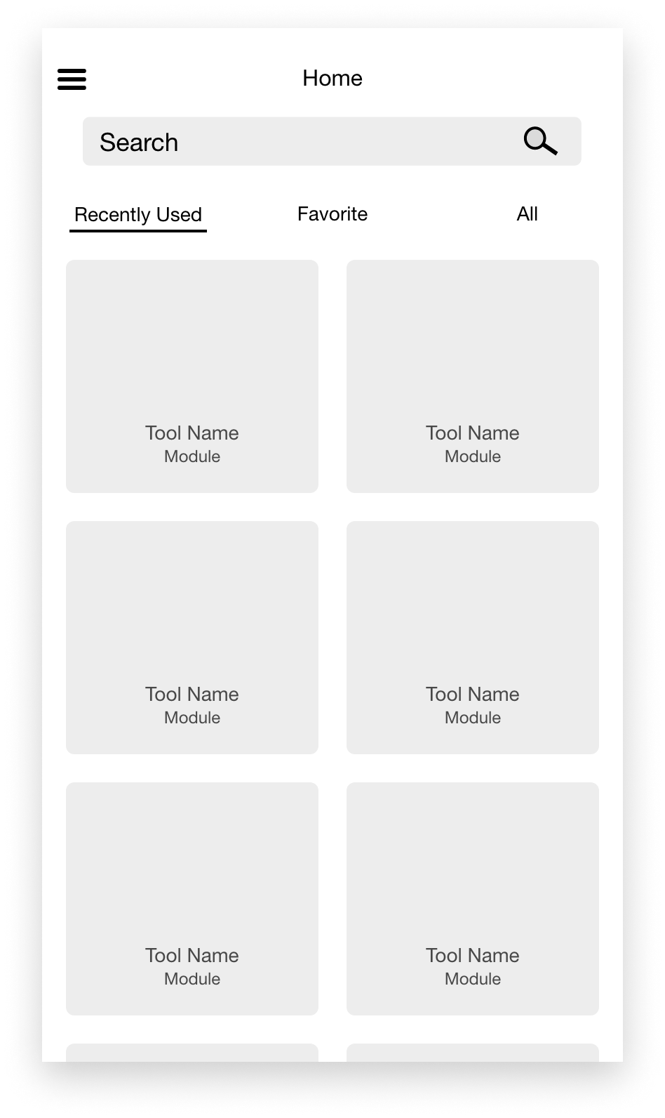
1) Landing Page
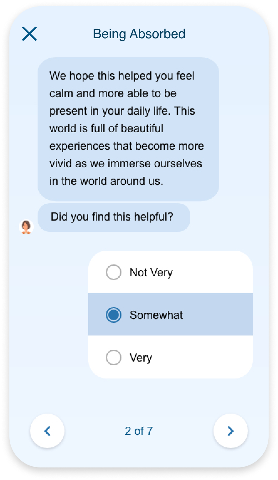
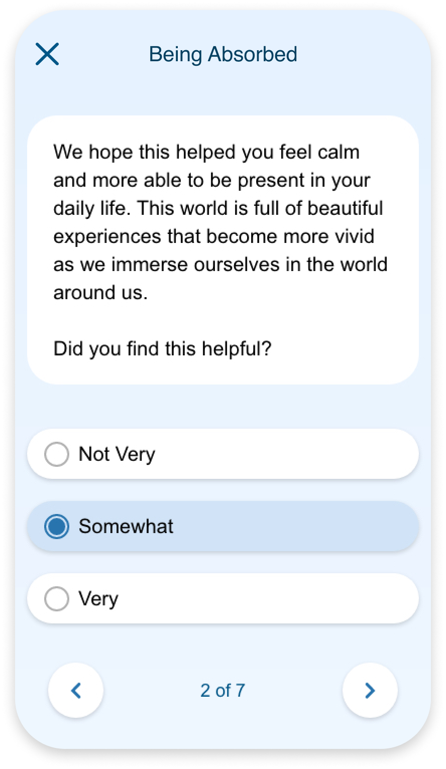
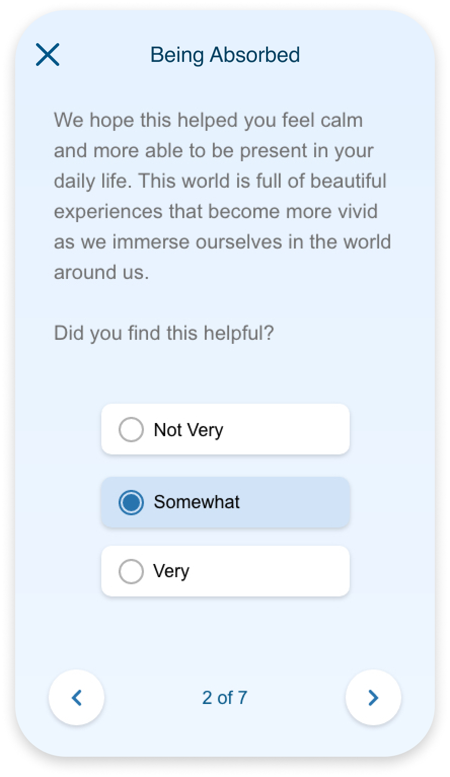
The treatment will consist of modules that are bundled into a personalized package. I envisioned this modularized program as a grid on the home page.
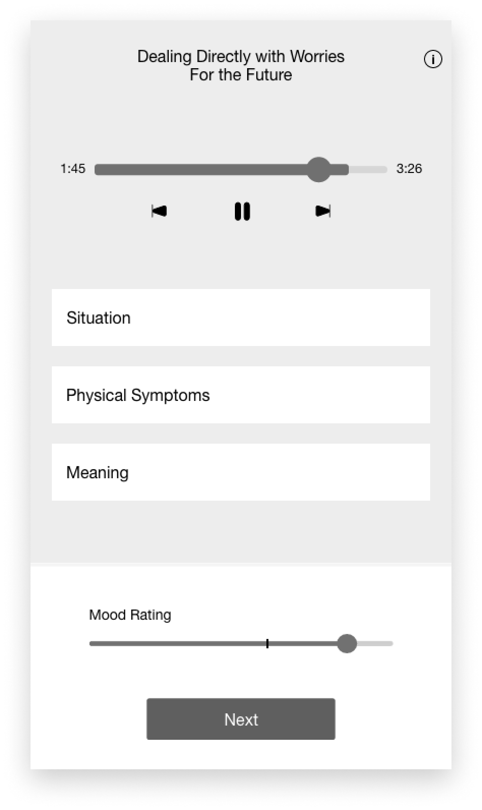
2) Individual Tool Screen
Understanding the clinical benefit is key to motivating participants to continue treatment. This meant highlighting the why for an exercise in order to help participants progress. With this in mind, I sketched foundational content types.
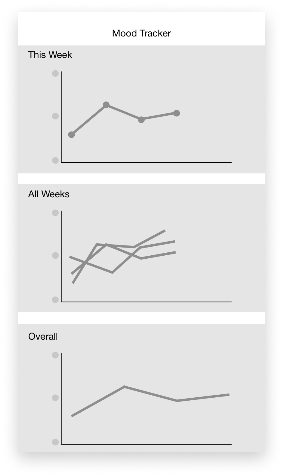
3) Progress Visualization
Seeing concrete progress also motivates participants. Meanwhile, mood trends was an important clinical metric. I designed a separate page dedicated to visualizing mood over time as a first step towards addressing these needs.
Method
Think aloud protocols using the wireframes for concept tesing the core flow
Participants
5 students from a local community college
"There's information overload and I want more guidance on how to navigate through it all"
Key Takeaways
1) The workflows needed to be simplified in order to reduce cognitive load
2) We need to be conscientious of the language we use and lower the reading level to avoid posing a linguistic barrier
For our clinicians, it was important to keep certain tasks to maintain clinical benefit. For example, while a user may find it daunting to complete a series of written prompts, it is this very process that helps make their thoughts concrete in exposure therapy.
This conflict of interest pushed us to do another round of concept testing with mid-fi mocks. However, these findings made it clear that we needed to rethink the flow at a higher level. This led us to a new design challenge:
Around the same time, our dev team communicated that the current design would be too costly to build. Combined, tech scoping and user research led our team to brainstorm alternative ways to designing the tools.
In these working sessions with product and clinicians, I informed the team on user research findings and presented market research on mental health apps. After several sessions, we landed on a "narrative framework".
The Narrative Framework
A story-like approach that guides the participant through the technique progressively.
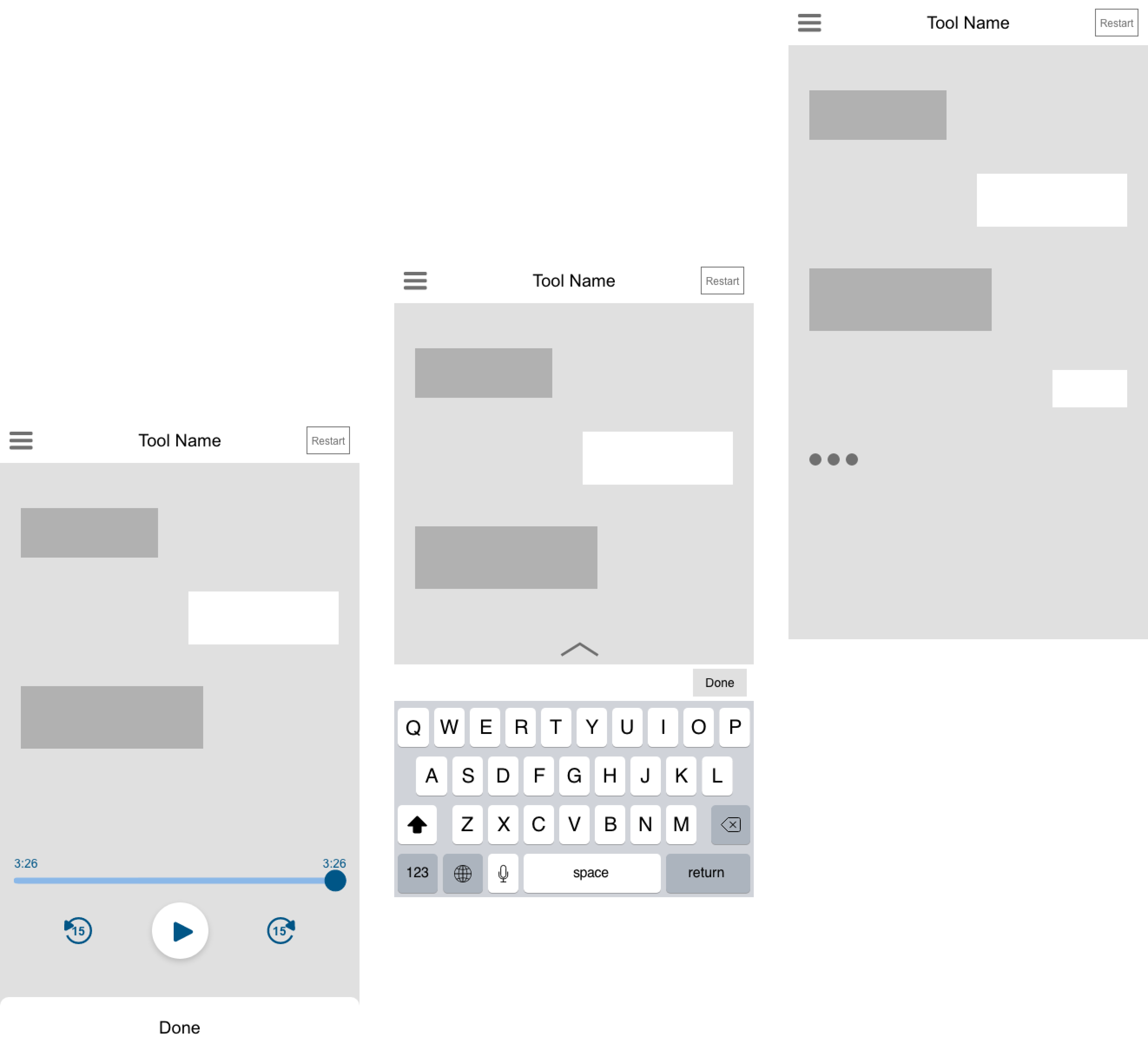
I created different designs ranging from a chat-like interface to more of a survey-like layout. My rationale was that a chat interface would create a more casual and friendly experience while a survey layout would be treated like a structured, learning tool.
Chat layout
Semi-chat layout
Survey layout
Easily integrate explanations about the tasks in a way that is part of the exercise. This aims to subtly and seamlessly assist participants with understanding the content to motivate them.
Present bite-sized information / tasks at a time to help participants make incremental progress and decrease cognitive load.
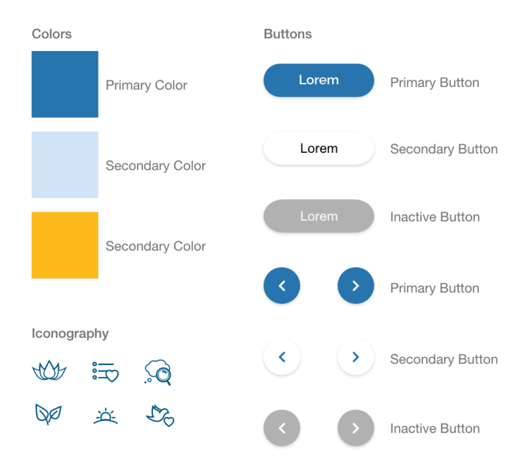
Throughout this process, I laid out the foundation for a mobile design system with a unique brand that still situated within the larger STAND design system, which was web-based only.
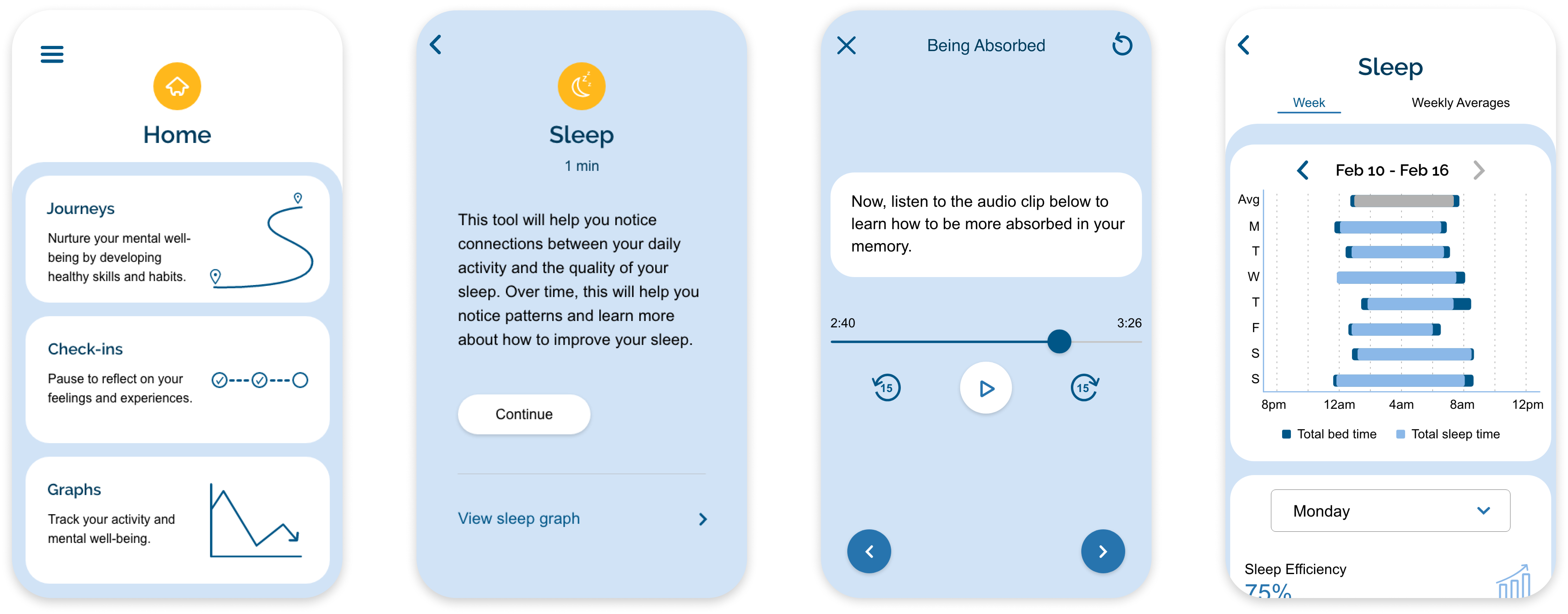
After building the core tool flow, it was time to design each interaction that would be the building blocks of the narratives that our clincians would put together. Here are 4 / 15 of the interactions I designed:

Mood Tracker
Voice Recording
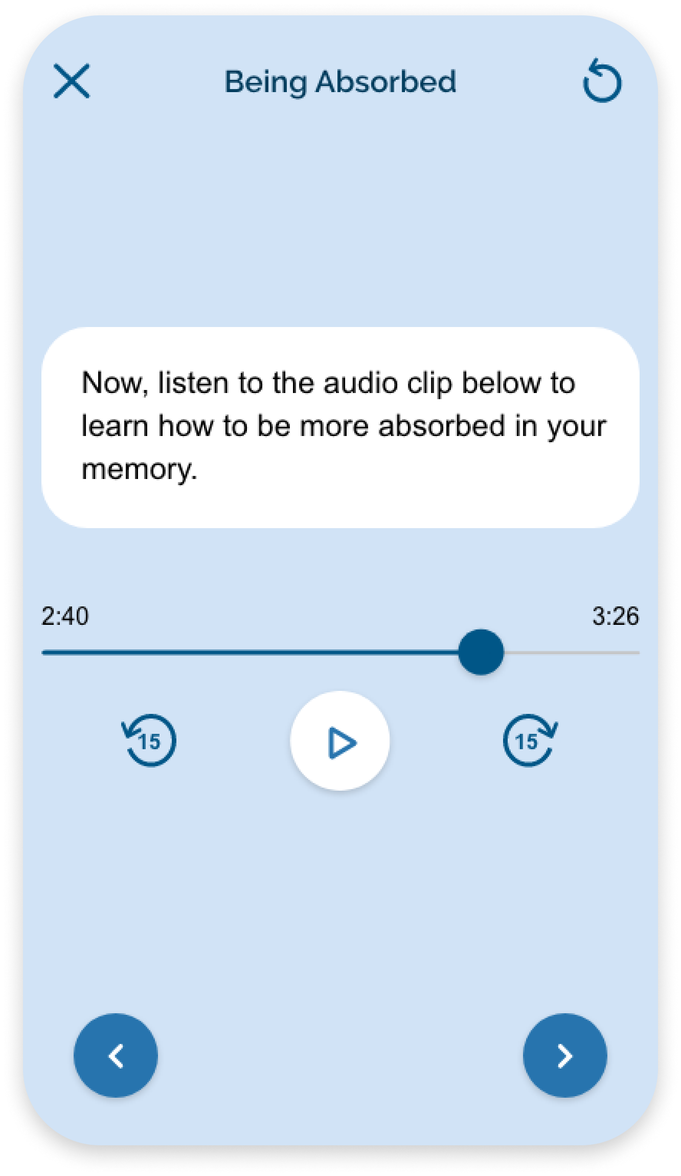
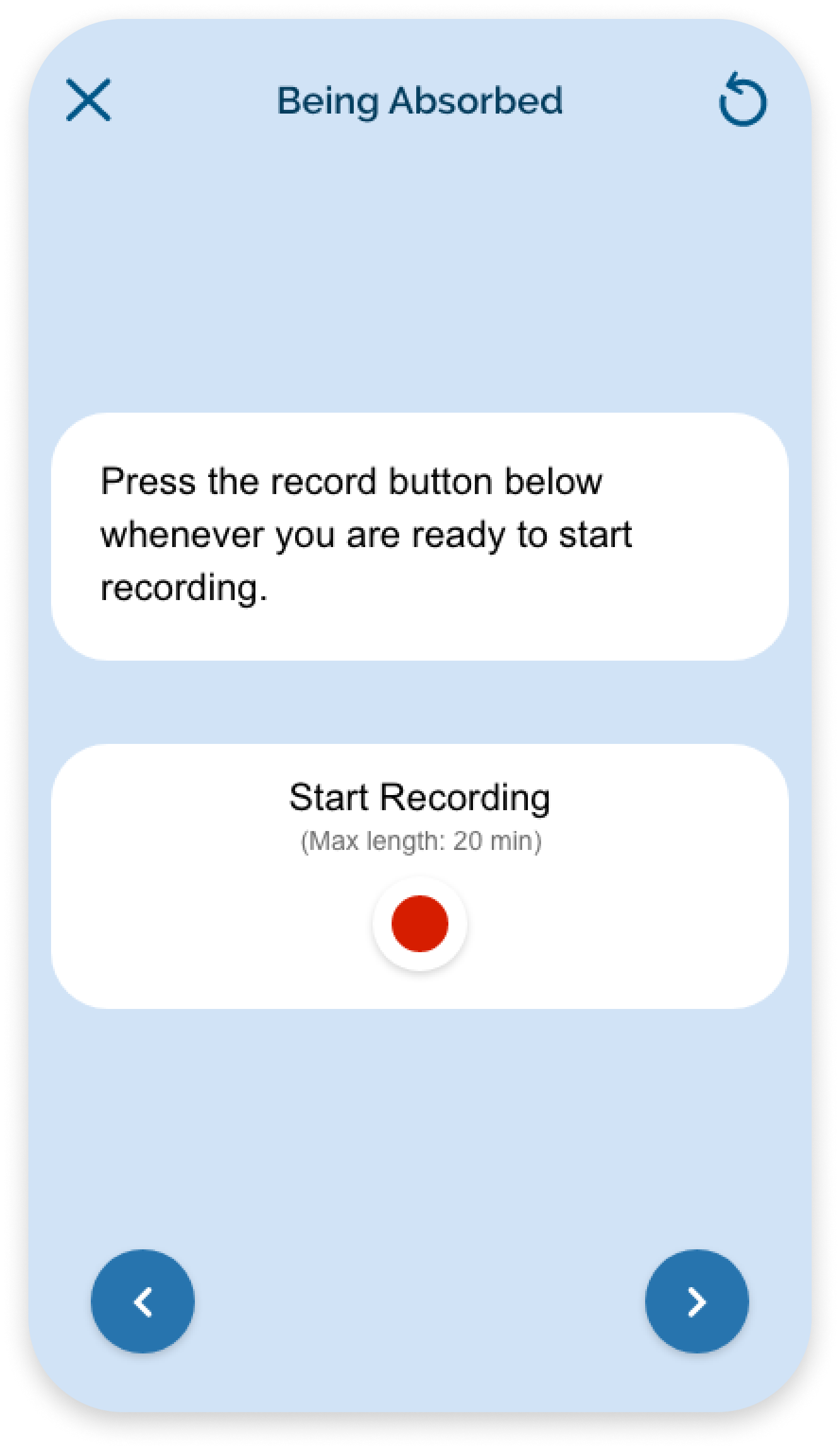
Guided Audio
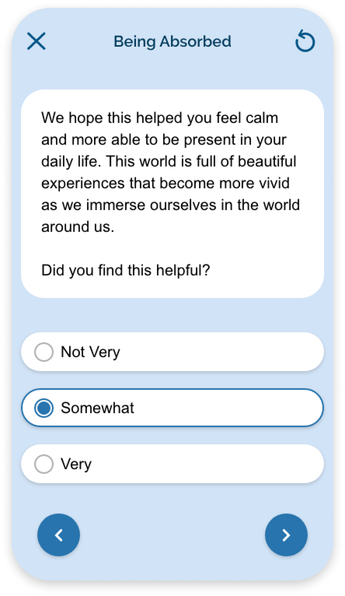
Multiple Choice
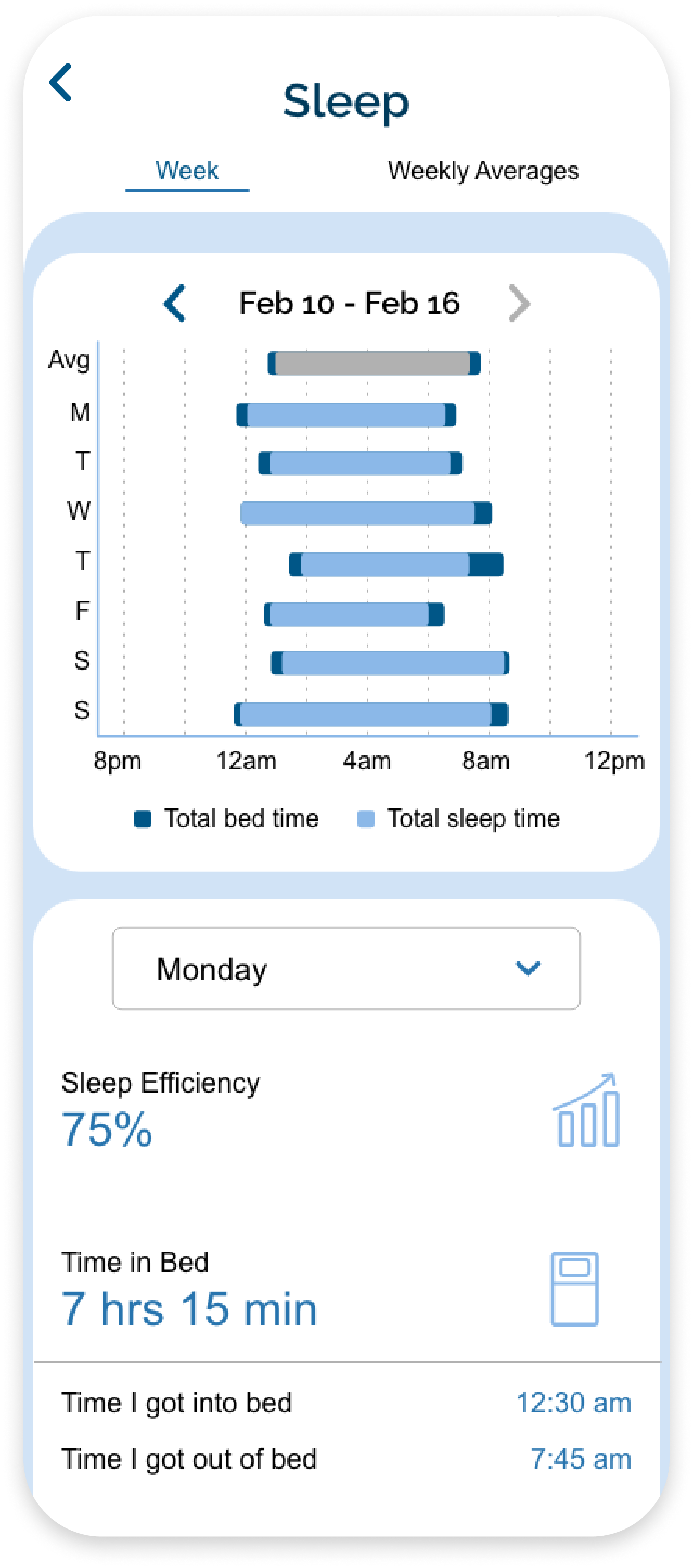
The last feature of the app is visualizing progress. I designed mood and sleep trackers that help participants monitor both their mood and sleep trends over time through data visualizations. We also provide a summary of the events and tools they've been using and how that correlates with their mood.
For sleep tracking, our clinicians had specific data to collect from users in order to measure their sleep. There were a lot of sleep variables and I wanted to avoid visualizing every variable as that could easily overwhelm the user. As a result:
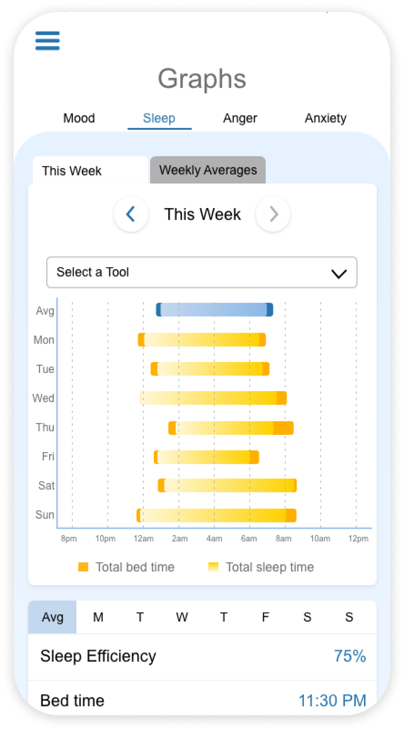
I ensured that all the designs were accessible by WCAG 2.1 standards.
The graphs were tricky since they were pure visuals and didn't have text that could be detected by screen readers.
I redesigned the graphs so that the information presented in the visualizations was conveyed in text as well.

Being the sole designer working on all the STAND iCBT products had been a very challenging yet rewarding experience. I learned how to zoom out and design for systems while also zooming down to specific pixels for production. Throughout the process, I learned to work within organizational constraints and balance the needs of internal stakeholders and users when making design decisions. While ensuring that the designs were ADA compliant, I realized that accessibility shouldn’t be an afterthought, rather, it’s an integral part of the design process that increases usability and creates a more inclusive product.